https://harmonyos.51cto.com
前言
一次开发多端部署,我理解是设计一个弹性UI框架。容器组件Flex从API version 7开始支持,它是弹性布局组件,这次就Flex的不同参数来作个简单的demo,一起来学习吧(ง •_•)ง
概述
Flex有五类参数,本篇先讲direction和wrap
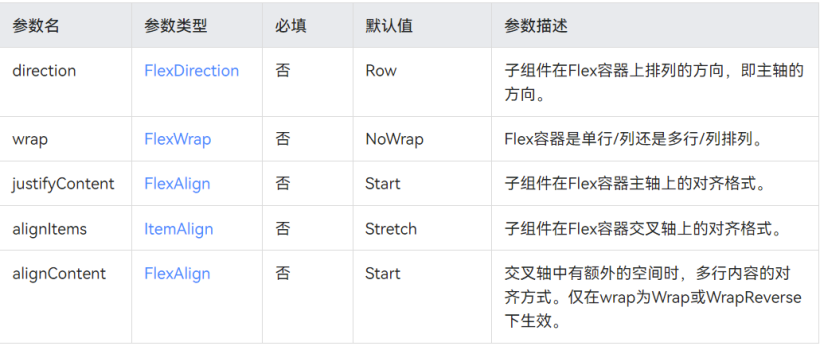
效果图如下:

正文
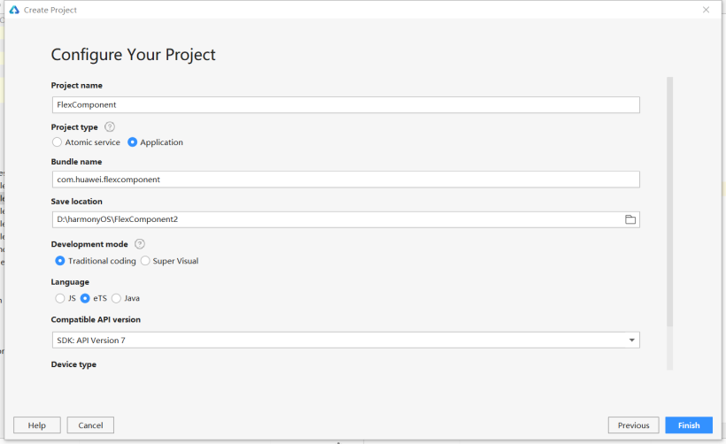
1、新建空工程
左上角File -> New -> New Project -> Empty Ability,language选择ets
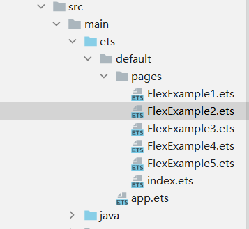
2、新建ets page
本次案例会在example1和example2上写
3、FlexDirection的Demo
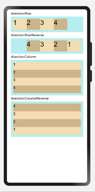
Row为行方向,Column为列方向;行方向的,设置四个文本组件,每个的宽度均为容器Flex的宽度的20%,则会预留一个20%宽的空位,通过效果图可见Row是从左至右,RowReverse是从右至左;而Column是从上至下,ColumnReverse是从下至上
代码如下:
// Example 01
@Entry
@Component
struct FlexExample1 {
  build() {
    Column({ space: 5 }) {
        DirectionRowFlex({text:'direction:Row',direction:FlexDirection.Row})
        DirectionRowFlex({text:'direction:RowReverse',direction:FlexDirection.RowReverse})
        DirectionColumnFlex({text:'direction:Column',direction:FlexDirection.Column})
        DirectionColumnFlex({text:'direction:ColumnReverse',direction:FlexDirection.ColumnReverse})
    }.width('100%')
  }
}

@Component
struct DirectionRowFlex{
  private text:string
  private direction:FlexDirection
  build() {
    Column({ space: 5 }) {
      Text(this.text).fontSize(15).width('90%')
      Flex({ direction:this.direction }) {
        Text('1').fontSize(30).width('20%').height(50).backgroundColor(0xF5DEB3)
        Text('2').fontSize(30).width('20%').height(50).backgroundColor(0xD2B48C)
        Text('3').fontSize(30).width('20%').height(50).backgroundColor(0xF5DEB3)
        Text('4').fontSize(30).width('20%').height(50).backgroundColor(0xD2B48C)
      }
      .height(70)
      .width('90%')
      .padding(10)
      .backgroundColor(0xAFEEEE)
    }.width('100%').margin({ top: 5 })
  }
}

@Component
struct DirectionColumnFlex{
  private text:string
  private direction:FlexDirection
  build() {
    Column({ space: 5 }) {
      Text(this.text).fontSize(15).width('90%')
      Flex({ direction:this.direction }) {
        Text('1').fontSize(18).width('100%').height(40).backgroundColor(0xF5DEB3)
        Text('2').fontSize(18).width('100%').height(40).backgroundColor(0xD2B48C)
        Text('3').fontSize(18).width('100%').height(40).backgroundColor(0xF5DEB3)
        Text('4').fontSize(18).width('100%').height(40).backgroundColor(0xD2B48C)
      }
      .height(160)
      .width('90%')
      .padding(10)
      .backgroundColor(0xAFEEEE)
    }.width('100%').margin({ top: 5 })
  }
}
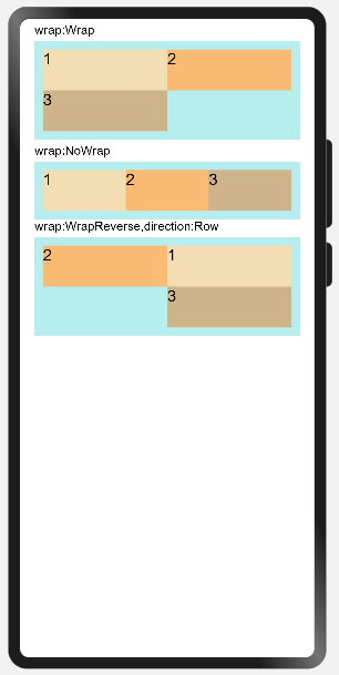
4、FlexWrap的Demo

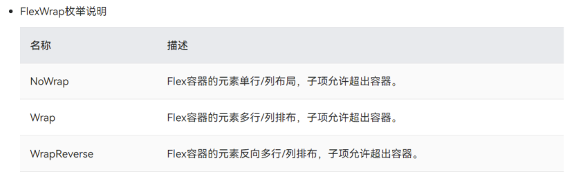
同样定义的Text组件在Wrap和NoWrap下的布局效果不一样,在允许多行排布的Wrap(direction默认Row),单个Text组件的宽度如设置一般,为容器组件的宽度的50%;而在NoWrap单行排布,3个50%会超出100%,因此显示的排布为三个的占比,即50%/50%+50%+50%。WrapReverse为Wrap的反向,即为多行/列排布,方向为从右至左/从下至上
代码如下:
// Example 02
@Entry
@Component
struct FlexExample2 {
  build() {
    Column({ space: 5 }) {
      WrapFlex({text:'wrap:Wrap',wrap:FlexWrap.Wrap})
      WrapFlex({text:'wrap:NoWrap',wrap:FlexWrap.NoWrap})
      Text('wrap:WrapReverse,direction:Row').fontSize(15).width('90%')
      Flex({ wrap: FlexWrap.WrapReverse,direction:FlexDirection.Row}) {
        Text('1').fontSize(20).width('50%').height(50).backgroundColor(0xF5DEB3)
        Text('2').fontSize(20).width('50%').height(50).backgroundColor(0xFFBC79)
        Text('3').fontSize(20).width('50%').height(50).backgroundColor(0xD2B48C)
      }
      .height(120)
      .width('90%')
      .padding(10)
      .backgroundColor(0xAFEEEE)

    }.width('100%')
  }
}

@Component
struct WrapFlex{
  private text:string
  private wrap:FlexWrap
  build(){
    Column({ space: 5 }) {
      Text(this.text).fontSize(15).width('90%')
      Flex({ wrap:this.wrap}) {
        Text('1').fontSize(20).width('50%').height(50).backgroundColor(0xF5DEB3)
        Text('2').fontSize(20).width('50%').height(50).backgroundColor(0xFFBC79)
        Text('3').fontSize(20).width('50%').height(50).backgroundColor(0xD2B48C)
      }
      .width('90%')
      .padding(10)
      .backgroundColor(0xAFEEEE)

    }.width('100%').margin({ top: 5 })
  }
}
结语
以上就是我这次的小分享啦!!2022,学习路上继续前进!
https://harmonyos.51cto.com

© 版权声明
文章版权归作者所有,未经允许请勿转载。
相关文章
酷开网址导航收录名站网址,为您提供新闻、音乐、视频、小说、游戏等优秀网站、包括在线电影免费观看,与多种搜索引擎 、分享互联网实用最新的资源,在线小游戏,免费音乐下载,免费小说网,绿色软件等资源网站。
 蜀ICP备20004578号